
 How to resolve AdBlock issue?
 An Email Data Visualization Primer

Data visualization is an important part of email marketing and it’s reporting. In fact, many marketers are already using it even if they don’t realize it. For example, if you graph your email metrics over time, then you already visualize your email data. In a real way, making those charts IS what data visualization is – presenting data using visuals instead of summary tables of numbers. I would define data visualization as “presenting data as images such as charts or graphs to tell a story beyond just a table of numbers.” Data visualization is about telling a story in a way that anyone can understand – whether they be an executive, a fellow team member, or another party (consumers, shareholders, etc.).
The main purpose of data visualization is twofold: to communicate data to interested parties and to provide actionable insights by identifying trends and opportunities. When designing your visualization, you need to consider the audience it is intended for to tell a story with the data that is interesting and actionable for that audience. For example, for the executive team your visualizations (e.g. typically dashboards) would focus on growth, contribution to profits/revenue, or progress on a specific business goal – e.g. we are overstocked on x, show progress on liquidating that inventory. While a dashboard for the email deliverability team would focus on their metrics such as sent, delivered, spam complaints, hard and soft bounces, with breakdowns by domain/ISP to spot problems.
There are a lot of data visualization tools you can use, from paid tools like Tableau or Power BI to free tools like Google’s Looker or even, trusty old excel that can do about 95% of what the others do. If the software can make charts and graphs, you’re on your way to visualizing data. The main differences between these programs are not functionality, rather they are data prep tools, connectivity, ease of use, and cost of ownership. Typically, the more it can help in data prep and ease of use, the more it costs.
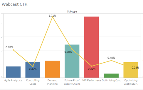
For my examples, I will use Tableau since it’s easy to use and a popular choice, especially for those using Salesforce (who owns it). The key to using it or any analysis program effectively is being able to segment your data. I talked about this in a previous OI Metrics article, “Segment Your Reports; Gain Deeper Insights.” In this chart below, I segmented by webinar topic for click rate to see what subscribers are interested. Then validated my expectations using attendance and replay rates post show to see what was popular for the client’s audience.
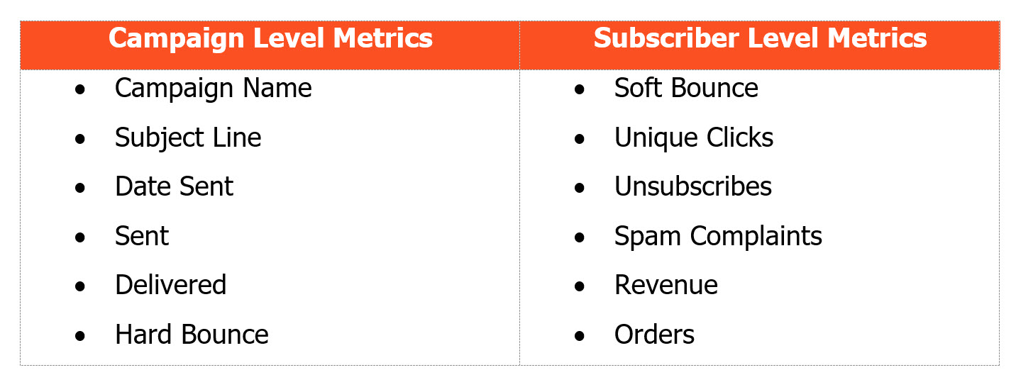
Generally, you have two levels of granularity to work with: campaign and subscriber. In this article I’ll focus on visualizing campaign data. When importing your data, don’t include rate-based metrics like CTR. Instead, you need to calculate them inside the software, so they work dynamically as data is updated in the visualization. This is true no matter what software you use. Here’s a sample of the fields or variables you will need to get started. For subscriber level data you also often need to calculate a lot of time-based variables, e.g. lifespan or days between actions. With the metrics below, you can calculate any other campaign level metric or rate needed, including many business KPIs like Revenue Per Email (RPE), Conversion rates, or Average Order Size.
During your initial data prep is the best time to setup a lot of aspects for the visualizations like number format, colors, fonts, etc. This way those choices will be used uniformly throughout your dashboard and charts to stakeholders. For example, Tableau will automatically update every chart in the file if you assign a color to that metric. Hence, every time delivered is shown it may be in light blue, while sent volume might be dark blue. Some people use their brand or client branded colors for charts and graphs. I typically use the same colors every time based on (my personal) associations – i.e. revenue and conversion metrics are shades of green, while bounces and spam complaints are shades of red.
For number formats for rates, I usually use at least one decimal place, often two for uniformity. I find that for certain email rates such as spam complaint rate you need to go to hundreds of a percent in reporting. Many metrics in email are counts in whole numbers where I use punctation to make it easier to read (e.g. Sent 1,550,000). Keep in mind readability is key to making a good visualization, including using easy to read fonts that will scale well for different screen sizes. Charts and tables are usually displayed much smaller in dashboards than in the chart itself. The goal of the charts in any dashboard is conveying critical information to the audience regardless of data skills or familiarity. You can’t do that if it’s hard to read, which takes the focus off the story you are telling.
For email metrics, I am big fan of dual-axis charts for graphing rates of interest over time because they put metrics in context. For example, I might a have bounce rate of 5% today because 1 person out of 20 made a typo when signing up for my welcome message. In contrast, if my hard bounce rate for a regular campaign was 5%, I would be worried as that means we have thousands of bounces. Seeing the volume tells me it’s more due to math than a dirty list I need to perform hygiene on.
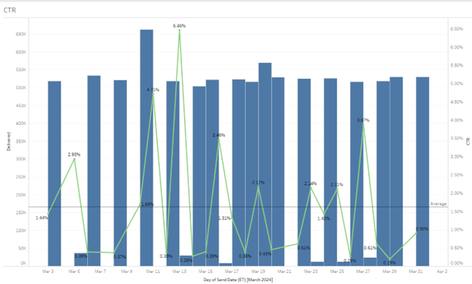
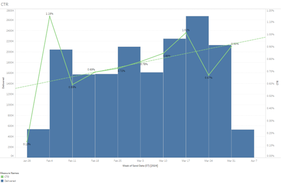
Below is an example showing CTR with a reference line to show the “average” CTR for the period by day. This makes it easy to see that we’re improving over time as we see more campaigns hitting above average as we go. Using reference lines in your charts to show either the average for the period, trend lines based on the period, or a threshold reference line. For example, we might have spam complaint rate references line at 0.3% for Google’s new limit and the trusty 0.1% that most people would recommend. Now it becomes very clear which campaigns were safe (under 0.1% line), which were iffy (between the two lines), and which are outright bad (above the 0.3% line). In Tableau it’s easy to even color code marks or numbers that fall into those as Red, Yellow, and Green as visual indicators of performance. Again, the dual axis showing the volume also puts things into perspective – 1 spam complaint out of 100 is 1% rate but that’s not viewed the same as getting 100 complaints on a volume of 10,000 which is also 1% by ISPs.
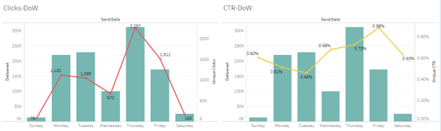
Another aspect of charting to consider is timing and aggregation. Often a roll up by periods is more effective at showing trends as it smooths out the variability. For example, if I send 3-4x a week and show daily time periods I get a lot more spikes in my data making it hard to see overall trends. If I turn that into weekly time increments it will move the rate’s line and make spotting the trend easier. Of course, most visualization tools will also add trend lines too.
For example, compare these two charts, first is by aggregated by day vs. second aggregated by week:
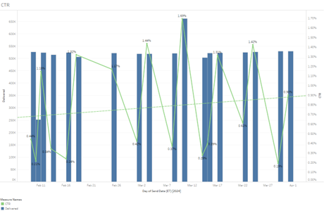
If I am trying to determine if my click rates are trending up, the weekly chart is much clearer that click rates have been on the upswing, even without the trendline.
If you send at a frequency less of less than 5-7 times a week, often weekly is clearer to show trends. Often moving up a time increment (I send weekly or bi-weekly and show monthly) will smooth out the chart making it easier to find trends. Another way to use time roll ups is to detect things like seasonality and year over year trends. Finally, most tools will also do breakdowns based on timestamps like day of week or hour of day. Overlay that with website traffic and you can start to see both impact of email on traffic and times of activity to test for send times. There’s no best time or day to send really, you can find times to avoid or days to avoid. I do find that some targeting by broad timing segments improves results.
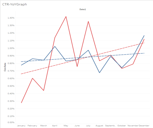
Year over Year charts require some calculations in Tableau and similar programs, but they are one of the most worthwhile to spot seasonal trends. Here we can see that the client has big upswings in April and July, which are greater than Holiday activity due to their sale schedule. For most retailers, if you graph several years of data for comparison, you can easily see a big drop off typically in June over the summer with a return to higher customer activity in August, that peaks in November/early December. This summer slump is why many retailers hold clearance sales or “Christmas in July” sales to counter act the typical drop off in orders during the summer.
No matter what kind of data you are visualizing, the prep work you put in makes all the difference. In Tableau and other programs, you can group things based on various factors such as excluding all sends that say TEST in the subject line or group subject lines by offer type (if it has % sign in the SL, that’s a percentage discount offer, if it says “Buy One Get One” or “BOGO”, it’s a BOGO offer, etc.). Now that you have them grouped you can compare them in various charts easily. What type of offer gets the best response? Also great for offer testing – e.g. we offer 10% vs 15% vs 20% off first order in a welcome series as a test – which had the highest RPE and Conversion Rate?
Another variable to think about including is segment definitions. For example, one segment used active in past 90 days for a month, the following month I used active in the past 120 days for the sends. Now I can compare the sends to each other – am I getting better inbox placement resulting in more clicks with the tighter segment? Or did the CTR go up because I reduced send size? Here those dual axis charts can help with making that determination. If wider segments also pull more spam complaints, I may get less clicks (and lower CTR) on the volume due to junking in response by the ISPs because people don’t read the email in the junk folder.
There are many ways to use data visualization, but the best thing to do is get started with it. You’ll find the insights that drive real increases in conversion and revenue with these techniques. Start with basic email metrics to get a feel for the tool and how it works. Then move on to business KPIs to keep your finger on the pulse of what matters to the business. This will also help to advocate for the email program, so get started today and use those visualizations to not only improve your email program but also to get the credit the email team deserves for driving the business forward. Good luck with your visualizations!
 Photo by Luke Chesser on Unsplash
About the author

Luke Glasner, Consultant/Owner, Glasner Consulting
Luke Glasner has been working in email marketing for over 15 years. He founded Glasner Consulting in August 2009 to help clients with email marketing strategy and analysis.
At the Email Experience Council (eec), Luke led the SAME Project, an industry initiative aimed at the creation and adoption of industry standards for email metrics, in his role as the co-chair of the Measurement Accuracy Advisory Board of the eec from 2008 to 2012.
He’s also served as a Judge for DMA/ANA ECHO Awards since 2011 and for the MMA’s Smarties Awards in 2015 to 2019. Luke Glasner earned his Master of Science in Integrated Marketing at New York University concentrating in Marketing Analytics.