Email has an image problem. Here's how to solve it.
When Andy King asked me to curate a collection of noteworthy emails for Email Love and join him on his Email Love podcast, I knew right away my theme would be designing emails for images off, as this has always been something I’ve advocated for – ever since I performed my first A/B test for a client to determine which design style delivers more conversions.
Since the Email Love podcast in early October, several fellow members of Only Influencers have also weighed in:
- Jeanne Jennings (Email Optimization Shop): Stop Sending All-Image Emails Now — Here’s One More Reason
- Jonathan Pay (Holistic Email Marketing): Email Love Live with Kath Pay: Designing for AI and Accessibility in Email Marketing
- Ryan Phelan (RPE Origin): Stop insulting your audience with this email behavior
- Dela Quist (Ask Dela): Image-Only Emails: Context, Strategy & What Really Works
I love a gorgeous email image as much as anyone, but you must balance aesthetics with functionality. That's why I have advised my clients against sending all-image emails for years and why my design training course focuses on designing for emails using HTML, images and live text.
In the early days of HTML, tech people overwhelmingly preferred text emails over HTML format and would consistently turn off images. But today, privacy concerns are leading people to read email with images off. Others simply don't change the inbox settings that prevent images from downloading automatically or from senders who are not in their contact lists.
Slow load times, on both desktop and mobile devices, can also turn an all-image or image-heavy email into a great white block of nothing. This affects mobile users more but can still be a problem for desktop users in areas with spotty internet connections.
They also impair email accessibility. Screen readers pick up on live text, not text embedded in an image. People who use them miss out on an image-only email's contents just like people who don't download images. When text doesn't supplement images, it wastes opportunities and hurts the brand.
AI changes make the image problem even worse
Now that Apple Mail's inbox changes are showing up for iPhone users who have downloaded iOS 18, the problem is becoming even more acute – and the situation isn't limited just to Apple inboxes! Gmail and Yahoo! Mail are either using or testing AI to extract content from emails and display it in the email preheader in the inbox instead of the copy you specify in your email format.
In short, if you provide no useful live text, like copy blocks, descriptive alternative text (alt text) for images, or footer copy like contact information, the mailbox provider's AI engine will pick up whatever it can find. That means your unsubscribe link – or worse! – could end up being promoted! Who wants that?
Disruptions like this eliminate any value from your email message and create a bad email experience that can hurt your brand image and experience with your customers.
Why do people send all-image emails anyway?
This issue has always baffled me. In my experience, it comes down to a question of form over function.
Designers who don't know email best practices might find it faster or easier to insert a single big image (sliced and diced as needed) in an email instead of setting up both images and text. Highly visual fashion or home decor brands, want a consistent look across their channels and expect strong visuals to carry the messaging load.
Brands might also assume that their subscribers are so engaged with their content that they'll download images every time. Neither of these reasons serves customers well!
My latest discovery: Alt-text really matters
I confronted this recently when working with a U.S.-based client that relies on opt-out email marketing. Their first contacts with prospective customers come through one-to-one cold emails that feature a powerful personalized image.
This brand makes every effort to make that first email a useful and engaging experience that highlights a positive activity in the prospect's life. Still, their prospects don't expect to hear from this brand, so they have not had a chance to add the brand's email address to their contact lists. So, many email clients block the personalized image in that first email unless the recipient adds the sender.
Now for the problem: We wanted to learn whether persuasive copy in the email would increase a prospect's interest in clicking through to the brand's offer or to purchase. My hypothesis for this test was that persuasive copy written to appeal to the four buyer modalities, would prompt more conversions than simple descriptive copy.
I knew persuasive copy had worked in other situations and was confident that the persuasive content would win. However, this persuasive copy was further down the email.
My client agreed, so their marketing team set up the two versions of the email and ran the test. My job was to review the test results. When I looked at the numbers, I was shocked to see that the control beat the variant.
Even more puzzling, the open rate was 10% less on the variant even though the subject line, preheader and what I coin “The Golden Real Estate” area were identical. These three things influence whether recipients will open an email and read further. But ... were they actually identical?
So, I dug into the two email versions to compare them. I discovered that the alt text supporting the personalized image in the control version was different from the alt text in the variant. This would have been revealed to readers who viewed the email with images off but not to those who saw the image. Thus, it was not the apples-to-apples test we needed to be confident our results were genuine. We couldn't say definitively that the control version was the winner.
As marketers we know faulty testing can send us down the wrong path, costing untold amounts in wasted budget and lost opportunities. When I looked at the email with images off, this huge error, compounded by other inconsistencies, leapt into view. But that is what our customers who block images are seeing and what likely influenced their actions instead of the copy.
5 tips to compensate for images off in HTML email
Even if AI tools didn't force our hands, we must accept that large blocks of email recipients – both B2C and B2B – will block email images, by default or by choice. But we have several tactics we can use to mitigate the loss of our gorgeous, evocative, and on-brand images no matter which email client your subscribers use.
1. Alt text all the time.
And not just any alt text, like "boots" or "dress." What would you tell a friend about your offer? Put that in your alt text: "Save 25% on new dress boots for winter." And while you're at it, style your alt text in an attention-getting font color (other than red, but maybe you could test that for effectiveness) and a size that will stand out in the square where your image is supposed to be.
Alt text is even more important now in this age of AI summaries and extracted copy. If you want your emails to make sense in both the inbox and the interior view, you must give AI scanning tools something to grab.
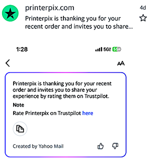
Your alt text can add context if an AI tool pulls it out and overrides the preheader you specified. It can also make your AI-driven summary more accurate and engaging, as in the example below from Yahoo Mail.

The top image shows the inbox view, which replaced the original preheader, "Tell us about your Printerpix experience," with the first line of the AI summary, shown in the bottom image. The summary itself includes a key element – a link to review the purchase. Had that link been embedded in an image instead of the email's HTML, the summary would have missed it, and the subscriber might have overlooked the review opportunity.
In his MarTech post, Ryan Phelan shared a hair-raising recording of a screen reader trying to decode an image-only email that also lacked helpful alt text. I encourage you to listen to it. If that doesn't persuade you to take a few minutes to toss in some well-chosen alt text or live text, then we need to have a serious conversation.
2. Embed live text in your HTML, not your image.
Live text refers to any copy that is embedded in HTML and thus will show up even with images off. You don't have to write a longwinded treatise on the virtues of your product. Just adding an email header or title and a short descriptive (or delightfully persuasive) copy block will give readers important information even with images off and something for AI tools to extract for the preheader or summary.
Having your contact information in live text is a courtesy for your customers, and making sure your unsubscribe link is clickable from the email will keep you on the right side of most email regulations. In other words, everybody wins.
3. Bulletproof buttons save the day.
These are call-to-action buttons that look like images but are formatted to appear even with images off. I remember when I learned about these at a conference more years ago than I care to remember. They're more common today but still not universally adopted.
There's no reason not to make the switch. A little HTML structure, some CSS styling, and you're in business. Plus, they make testing CTAs easy! Point your email developer to this simple tutorial by Email on Acid to get started.
4. Use a design hierarchy.
This refers to a framework in your email that you build with background colors, copy blocks, and varying bulletproof button sizes to make important content stand out without the context that images provide.
Without this hierarchy your images-off email can be a chaotic mix of elements jockeying for the reader's attention. In these days of short attention spans, that can be fatal for message impact and value.
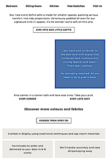
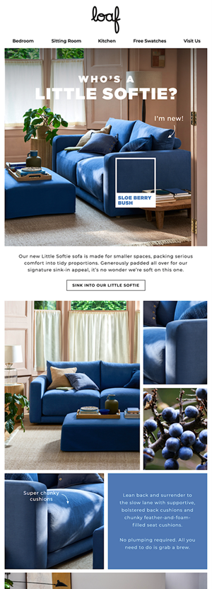
An effective hierarchy is at work in the email below from furniture manufacturer Loaf. At top is the images-off version. On the bottom is the email with images. View it in its full glory.


5. Seek out email inspiration.
Viewing email with images off is as easy as changing the settings in your own email client. But if you like to sort through and play with inspirational emails, visit my curated collection of emails hosted on Email Love, an email depository with a searchable database and functions that let you play with the email: view it with images off, see its raw code, look at it in a simulated mobile view, download the full version, and other fun things.
You'll find my Loaf email hosted there. But also check out the BBC Sounds email, which also uses a different style of hierarchy to corral a vast combination of images and copy into a sensible format for images-off viewing. I'm not a fan of their black-on-black styled alt text (enlarge the image to see it) but at least they're trying.
Be customer-centric with your email
The best emails I see today are the ones that are created with subscribers in mind. They're aesthetically pleasing. They have a hierarchy that defines value and makes scanning as fruitful as reading every word. And they are both functional and valuable in every conceivable setting, from the tiny screen of a smart watch to the towering view of an oversized desktop monitor.
Marketers have gradually become more customer-centric in the years that I have worked in email marketing. I applaud this trend. AI tools also are supposed to improve this customer-first focus, even though it appears to work at cross-purposes with marketers' goals. But this trend will not be the email killer some have claimed it could be.
By understanding how AI is changing the game, we can do as we have always done – using the tools and skills we already have to overcome yet another challenge and keep email the vital communication channel that links us directly to our customers.
 Photo by sarandy westfall on Unsplash

 How to resolve AdBlock issue?