
 How to resolve AdBlock issue?
 Email Opt-Out Benchmarks

Earlier this year, I wrote a post for Only Influencers on Turning a Negative into a Positive which highlighted the value of analyzing the negative marketing signals generated by every email campaign (opt-outs, spam complaints, non-responders, etc.). I thought I would build on that topic just a bit before 2020 comes to a close, with a deeper look into opt-out behavior across industries to provide some context when looking at some of your own email campaign unsubscribe data.
For the past few years, we have been publishing reports and infographics built on large data samples of opt-out requests from across the OPTIZMO platform, encompassing over 400 clients, and thousands of email campaigns. It provides a unique look at consumer opt-out behavior driven by a spectrum of largely performance-based customer acquisition focused email campaigns.
One key thing to note, this data only looks at opt-out behavior, without the added element of send data. So, the reports don’t provide information around metrics like opt-out rate. However, separating opt-out request data independently from email send data can provide some interesting insights that may be lost or overlooked when mixed in with more typical positive campaign performance metrics. The data sample used for this report is from 2019, so stay tuned for an updated report in 2021 that will use 2020 data. While we haven’t seen major changes from year-to-year in past reports, 2020 might be an exception.
Opt-Outs by Email Domain
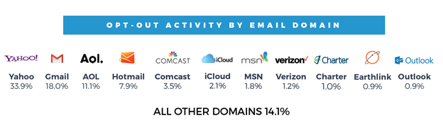
The data around email domains or inbox providers is interesting when compared to a list of the most popular email providers in the industry. It’s not surprising to find Yahoo! and Gmail at the top of the list, but we might expect their positions and percentages to be flipped. This is a great metric to look at in your own campaigns and compare it to the makeup of your mailing list. You might find that certain email providers have a noticeably higher opt-out rate than others.
Daily Opt-Out Activity
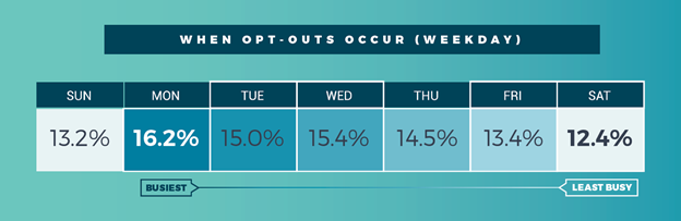
This pattern has remained fairly consistent year-over-year, with the slight change that in past years, the downward trend was consistent from Monday through Saturday.
When Opt-Outs Occur
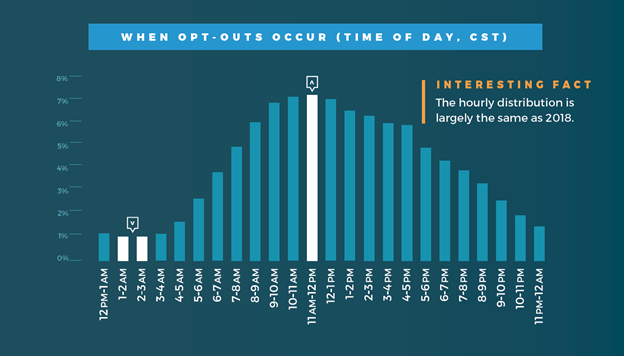
Opt-out activity during the day picks up steam as people come online in the morning, peaks around mid-day, and then tails off through the afternoon and evening. While there were slight variations by day of the week, the activity trend is largely consistent during every day of the week.
Opt-Outs by Device Type

This is an interesting statistic to watch over time. Opt-out activity on mobile devices has grown each year, similar to the trend of users shifting their email access and overall online activity over to their mobile devices. However, we see a larger percentage of opt-out activity on mobile than you might expect based on many published metrics on how often mobile devices are used to access email inboxes (I’ve seen them ranging from 42% - 62% from various sources.)
Opt-Outs by Browser and Operating System
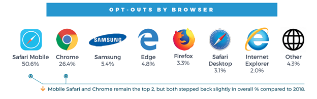
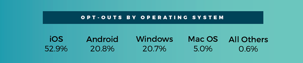
This provides a deeper view of the mobile vs. desktop distribution of opt-out activity, by bringing in browsers and OS data. With the growing percentage of opt-out activity coming from mobile devices, it’s not surprising that two mobile operating systems would take the top positions. However, iOS ranks slightly ahead of its market share.
You can download the most recent 2019 Email Opt-Out Infographic released earlier in 2020 on the OPTIZMO website. You will find previous reports in the Research & Thought Leadership library.
About the author
 Tom Wozniak is the head of Marketing and PR for OPTIZMO Technologies, delivering the industry’s most powerful platform for email compliance and suppression list management to clients throughout the U.S. and around the world.
Tom has over 20 years of experience in email, affiliate, and various other digital marketing channels. Prior to OPTIZMO, he was VP of Marketing at SpotX, headed up marketing at Media Breakaway, and held senior leadership roles with Trueffect and NextAction, among other companies. He regularly writes for several industry publications and speaks at various affiliate and email marketing industry events.