6 Subscriber Acquisition Tactics to Fastrack Your Email List Growth (Part 1)
If you take them aside in confidence and buy them a drink or two, most people working in email marketing will eventually admit there’s a hungry beast they have to deal with that is never full and always has an appetite for more. No matter how much or how often they feed it, it’s a bottomless pit.
What is this monster? It’s none other than your email list! Actually, if you’re treating it right, it’s more like an elite athlete than a monster. Chances are, no matter how many subscribers you already have, you hunger for more. The simple truth: the care and feeding of your email list is a job that’s never done (and shouldn’t be).
The constant need to acquire new email list members is fueled by a few unchanging facts: Brands continually seek greater market share, which means increasing visibility and interest among non-list members in order to bring them into the fold and once we do – turning them into customers. Not only do we want to grow the number of prospects we can communicate with through email, but many companies are also challenged by having subpar percentages of customer email addresses on their files, so seek better coverage of customer opt-ins to email. Couple those realities with the inevitable churn most email lists see annually due to unsubscribes, aging data and deliverability issues (30% turn-over is not uncommon) and it’s no wonder we can’t satisfy the beast!
Email marketing’s early days seem like ancient history now, which presents both new subscriber acquisition challenges and opportunities. Unlike the age of commercial email’s inception, the novelty of receiving savings, coupons, content and other exclusive goodies promised to subscribers wore off years ago. List members expect that at a minimum, and expectations are rising – subscribers now want us to surprise and delight them, anticipate their needs, and enable or remind them to make their interactions with us efficient and convenient.
On the bright side, we have more tools and tactics at our disposal than ever before to invite new subscribers on to our lists. Here are the top-performing new-subscriber acquisition practices that should be in place for your program:
1. Sign up forms on your site
You want people to sign up for your email? Well for heaven’s sake, make it impossible for them to miss the chance to do so right from your site. Give them visible, easy ways to do just that without having to do anything else (like buy something or register for an event). Add permission names to your list with simple sign-up forms you place on your site in strategic areas. Make this process as fast and frictionless as possible - requiring minimal data points (many companies ask only for the email address). And by the way, intentional redundancy is fine. You might have a single-field opt-in bar on the home page, a longer multi-field opt-in form deeper into your site.
Most email service providers, marketing automation systems and even blog widgets provide apps or code for sign-up boxes, so you don’t need to be a coding rock star to implement a variety of different email sign-up options on your site.
My one simultaneous piece of advice and beef with these, however, is that they are too often buried so deep as to be invisible. I get it – email list growth isn’t a top priority for all companies, so in the fierce competition for what gets prime placement on the home page, the email list opt-in is often relegated to the bottom. There’s a work-around for this (see tactic #3 below) but still, if a site visitor can’t find out how to join your list, you’re making them work too hard to bother. And remember, some of those visitors are your customers who still haven’t given you an email address; they’re high priority.
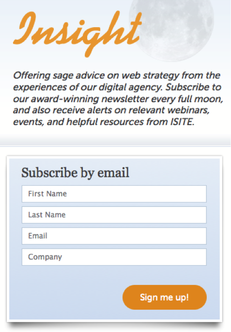
Here’s a good B-to-B example with plenty of personality from a digital design agency called iSITE. The sign-up box is highly visible on their blog home page and attempts nothing more than newsletter opt-in:
And here are a few more easy options:
From TravelChannel.com:

And Godiva.com
![]()
2. Lead Magnets to Gated Content or Perks
While it’s great to have simple invitations on your site to join your email list “just because”, it’s even more effective to trade something of immediate value for those subscriber names you’re gaining. Some people want to hear from you, and will sign up for your email with no further incentive. But the rest need a push. These days that’s happening mostly through free gift and loyalty program invitations (hard offers), or content marketing (soft offers) gated behind a sign-up form.
Content is a fantastic “magnet” to attract and qualify exactly the people we want – qualified prospects – especially for products and services with a longer conversion path down which we need to nurture those prospects. It’s huge in B-to-B marketing because purchase decision-making cycles are longer, products can be complex, and approval processes are multi-layered. We will need to educate buyers not just on our products, but how to use and benefit from them, why we’re better than the competition, and so on.
The best “lead magnets” deliver instant gratification because they solve a problem (relief) or enrich someone’s life (make them smarter/happier/richer). They can be in any medium – in fact video and webinars are wildly popular because they’re more interactive. So develop your lead magnets and promote them not only on your site but also on stand-alone opt-in pages. Here are a few lead magnets I’ve come across on various sites:
Outback Steakhouse

Social Media Examiner:

Leisure Arts (a crafting site)

3. Light Boxes (aka Pop-up Windows)
Unless you haven’t surfed the ‘Net for several years, you’ve surely noticed the growing prevalence of light boxes, a type of pop-up window timed to appear after a visitor has spent “x” number of seconds or minutes on a site. This tactic doesn’t take the user away from the browsing experience, but does interrupt it in order to invite email opt-in.
A recent report by AppSumo, provider of light box technology, found the average conversion rate for email light boxes at nearly 2%. That may not seem monumental to you, but remember that’s just an average! Many marketers who have tested them report conversion rates as high as 5-10% and lifts of 300-500% in new subscribers over static sign-up forms. In fact, light boxes have the highest conversion rate of any on-site email subscriber acquisition tactic and the highest of the three discussed here.
Because light boxes are customarily programmed to appear only to new visitors and/or non-email subscribers, they’re the ideal choice for proactively reaching probable email subscribers while you already have their attention. The also alleviate the need to hunt for your sign-up forms or allocate valuable home page space to sing-up boxes. But, you have a limited window of opportunity with light boxes because you can’t keep interrupting people forever, and will eventually have to rely on the more passive attempts described above to entice ongoing visitors to join your list.
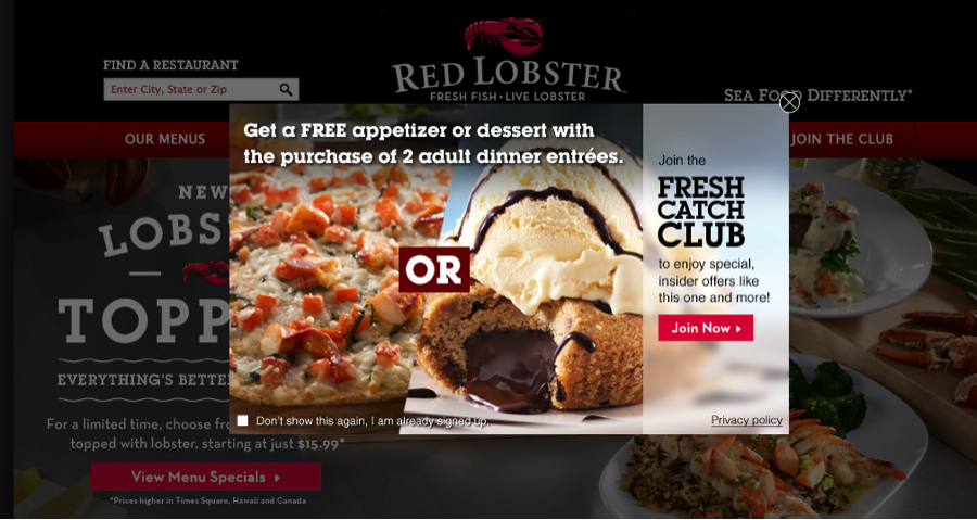
These first two examples below (from Red Lobster and Spanx) are actually just gateways into longer sign-up forms and aren’t collecting data themselves, although could be. Notice how Red Lobster even attempts to give visitors choice and control by including a “don’t show this again” checkbox in the lower-left corner.
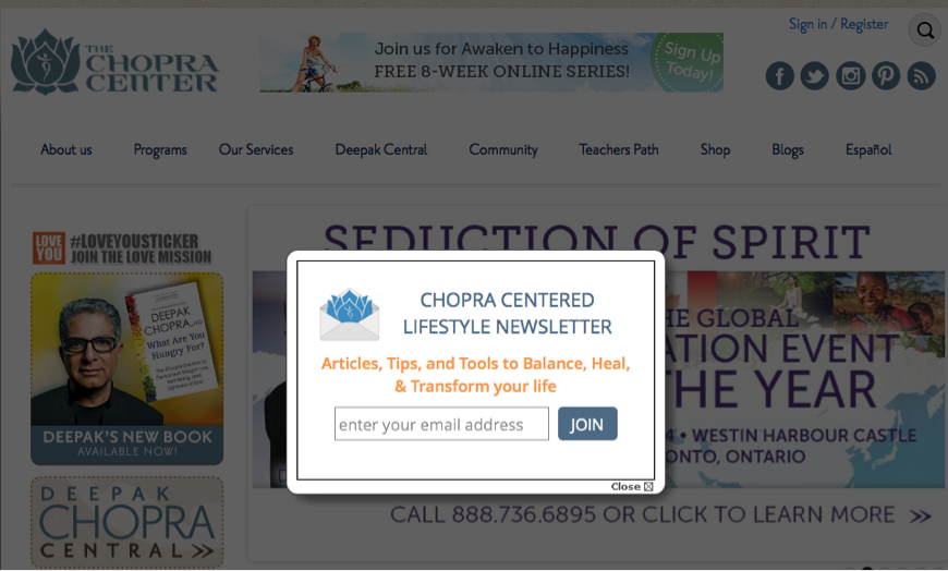
On the other hand, the example from the Chopra Center cuts right to the chase, collecting the email address via simple form field embedded in the light box. My recommendation? If list growth is a high priority, make data capture a one-step process. If not, experiment with the two-step process like Red Lobster does. Not sure? Test two light boxes (one with data capture, one without) against each other.
Red Lobster
Spanx

Chopra Center
Whether you’re using these three email subscriber acquisition tactics already or not, don’t think of them as “either/or” choices – think in terms of “both/and”. These practices should be intentionally redundant because if one doesn’t capture the attention of a prospective subscriber, eventually another will. You want sign-up boxes to be perpetually present – even if obscure; keep content widgets on the site but test and change them out over time; and have light boxes appear in a proactive effort to woo new visitors to your list.
In part 2 of this series we’ll explore three more strategies for email subscriber acquisition. Until then, here’s hoping these help you keep feeding the beast!

 How to resolve AdBlock issue?