
 How to resolve AdBlock issue?
 How Did 2020 Impact Email Opt-Out Activity?

For the past few years, OPTIZMO has been publishing infographics based on email opt-outs processed on our platform (100s of millions every year). While there are many insightful reports, white papers, and infographics released every year by various companies in the email marketing industry, the vast majority focus on email activity and campaign performance across "positive" metrics, like emails sent, deliverability, open rates, click rates, conversions, etc. But most reports don’t spend much time, if any, delving into negative marketing metrics like opt-outs.
Last year I wrote an article for OI on Email Opt-Out Benchmarks, based on data from OPTIZMO’s annual Email Opt-Out Infographic for 2019. The trends and data from previous years and through 2019 tended to show gradual shifts in email recipient behavior, but we all know that 2020 brought unprecedented disruption to everything from business activity to the simple action of individuals going outside their homes and interacting with other people.
We’ve already seen a lot of interesting data on how the pandemic impacted various industries, including email marketing, But the latest 2020 Email Opt-Out infographic represents the first significant look at opt-out behavior during the last year.
While we always let the data itself tell the story, when we began to analyze the 2020 data, we certainly had some questions on our minds about whether the changes to consumers' daily routines would translate to their Opt-Out behavior.
- Would having so many more people working from home make an impact on when people are most likely to unsubscribe?
- With people generally spending significantly more free time at home, would we see any changes in opt-out behavior across devices or software platforms?
We look at email opt-out behavior in three main categories - Where, When, and What. Let’s take a look at some highlights from the infographic data and see how it answers the questions we had about the impacts of 2020.
Where Opt-Outs Come From
One of the first areas we look at is opt-out behavior by various geographic data (region, country, etc.). The vast majority of our clients are sending email campaigns in the United States, which is reflected in the unsubscribe requests that come through our platform. We wouldn’t necessarily expect to see a significant shift in this geographic data, based on the impacts of 2020, and the data bears that out.
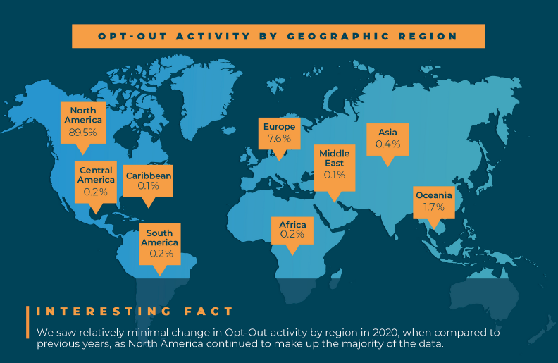
At the regional and country level, 2020 data was largely in line with previous years. We did see a small dip in the percentage of opt-out activity coming from North America and the United States (from 89.2% to 87.9%), but this shift is more likely due to shifts in our client base and their mailing activity, rather than anything to do with actual behavioral shifts among users.
When Opt-Outs Happen
In each infographic, we look at opt-out activity based on the day of the week and time of day. This is definitely an area where we might expect to see some changes in recipient behavior.
With more people working from home, their daily routines are likely impacted by having no daily commute and possibly fewer distractions during the day. (Although for those incredible parents who are working from home and somehow attending to their kids’ remote classwork, I think the distraction level probably went up significantly).
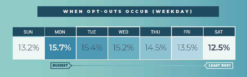
When looking at the data from a weekday perspective, we began to see some impacts on opt-out behavior.
For the past few years, we have seen a pattern where Mondays are the most active day for email opt-outs, with the daily percentages slowly dropping each day through Saturday, with a slight uptick on Sunday. While this pattern held true in 2020, taking a more detailed look at the individual days showed that the activity on every day of the week shifted toward the average.
So, some days (like Monday) saw a slightly lower percentage, while other days (like Saturday and Sunday) rose. One logical reason for the days to shift toward the average might be the simple fact that for many people, days tended to blur together in 2020 - I know they did for me. When you don’t have the natural rhythms of leaving the house for various tasks (work-related or personal) I know a lot of people who said that one day was a lot like any other.
When we look at activity on an hourly basis, we have always seen a consistent curve where opt-out activity slowly ramps up as people wake up in the morning, peaks around lunchtime, and then slowly tapers off through the afternoon and overnight. Then it repeats the next day.
While we see the curve change just slightly on weekends, it still remains largely the same. In 2020, the general shape stayed the same. However, we saw activity ramp up more quickly in the morning, peak around 10:00-11:00 AM Central time, and then gradually taper off through the rest of the day.
The shift in hourly activity can likely be attributed to people getting into "work mode" earlier in the day, as they don’t have to deal with the usual commute and transition time into the office.
What Technology Consumers Use to Opt-out
We look at a variety of data points with regard to the technology (hardware and software, etc.) associated with every email opt-out. So, each year, we look at trends across device types (mobile vs. desktop, operating system, browser, and email domain, among other factors). What impact would the work-and-stay-at-home aspects of 2020 have on this type of data?
For years, we have all watched internet access shift toward mobile devices, as people use their smartphones to surf the web, access apps, and check email. The trend toward more mobile activity and a reduction in desktop activity has been a consistent trend for years.
However, we saw this trend change in 2020 as opt-out activity on mobile devices dropped from 2019 (74% to 67%). We saw this shift reflected in data across operating systems and browsers as well, as more email recipients used a desktop device to opt-out of email campaigns than in previous years.

While the majority of Opt-Out activity still came from mobile devices, we had not previously seen a year where mobile activity dropped, in comparison to desktop.
This is probably the biggest single indicator of the impacts of 2020 on Opt-Out behavior. When people spend the vast majority of their time at home, month after month, it makes sense that they would use their mobile devices less and there would be a comparable increase in the use of their home computers.
However, the fact that mobile still made up 67% of Opt-Out activity also tells a pretty powerful story that even while we’re at home, we are still largely mobile-first consumers. We're checking email, social media, news, etc., on our phones, even as our computers are just a few steps away in our offices or on our dining tables.
Wrapping it up
Clearly, 2020 was a year unlike any that email marketers have seen before. As we get deeper into 2021 and more people get back to some version of a normal daily routine, including driving to an office at least a few days a week or spending more time out of the house in general, it will be fascinating to see how consumer behavior changes.
Will people largely shift back to pre-2020 behaviors or will some changes stick? We won’t know for sure until later in the year or in early 2022, when we run a new analysis.
About the author
 Tom Wozniak is the head of Marketing and PR for OPTIZMO Technologies, delivering the industry’s most powerful platform for email compliance and suppression list management to clients throughout the U.S. and around the world.
Tom has over 20 years of experience in email, affiliate, and various other digital marketing channels. Prior to OPTIZMO, he was VP of Marketing at SpotX, headed up marketing at Media Breakaway, and held senior leadership roles with Trueffect and NextAction, among other companies. He regularly writes for several industry publications and speaks at various affiliate and email marketing industry events.