
 How to resolve AdBlock issue?
 Stop Using These Email Marketing Techniques in 2022

Are there any email marketing techniques you’ve gotten tired of? I’ve gathered several examples of the most common mistakes and outdated strategies that some marketers are still stuck with in 2022.
Disclaimer: There’s no universal recipe for a perfect email marketing strategy. However, you can use the tips from this article to change your perspective and rethink the way you approach email marketing in 2022.
Email subject line & copy don’ts: which email copywriting strategies are no longer relevant
High-quality text is a sign of a good email campaign and shows subscribers that there’s someone caring behind it. However, there are some email copy techniques that might create the opposite impression.
1. Multiple “Long time, no see” emails. Reactivation emails are an essential part of any email marketing strategy, but begging inactive subscribers to visit your website will not turn them into brand evangelists. This approach may seem annoying and even pushy. After all, if a person isn’t eager to visit your website, how will a pleading email change their mind?
Try this instead: If a person has stopped visiting a website or reading emails, they probably don’t find your offers appealing anymore. The brand’s task here is to change their mind. Focus on your advantages to make the right offer.
My first choice would be a discount because it would help you understand whether a person is interested at all or not. If you don’t want to offer discounts, you can try segmenting your users and sending more personalized content that would meet their expectations.
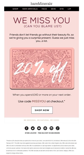
Here’s a good email from bareMinerals: the words and actions are in perfect harmony.
2. CAPS LOCK. In most cases, this looks like the sender is SCREAMING AT YOU. It's especially true for subject lines, just look at the example below.

Also, this technique is far from unique, so it won’t help your email stand out in the inbox.
Solution: There are lots of other ways to engage the audience: allusions to famous movies or books, suspense, interrogative sentences, emojis, or any other creative device.
3. Clickbait emails. I mean subject lines and email copies mentioning things that are simply not true to life. Email marketers use this technique more often than you might think. Remember those emails that promise you the moon but never keep the promise?
Another example from the same league is email campaigns that announce a “one day sale” every day.
This isn’t about creativity or provocation; it’s about trust. The users start losing their trust to brands the second they see a misleading message.
Solution: Always keep your word: for instance, if you’re going to launch a weekly sale, don’t send emails saying it’s going to be a one-day opportunity. Don’t try to trick your audience. If you made a mistake, simply apologize.
4. “Only for you” and similar expressions. In 2022, users are aware of bulk email. You don’t have to pretend it’s a unique email just as you don’t have to pretend you send every single email manually.
Solution: You can always keep email campaigns personalized using audience segmentation. If you want to emphasize the fact that you’re working on your UX personalization, you can do it in a more low-pressure manner: for example, personalized product recommendation emails.
Email design mistakes: check your campaigns for them
They say that first impressions are most lasting, and when it comes to email marketing, the first thing a user notices is the design.I asked the design team from my agency to share their least favorite and outdated email techniques.
1. Image-only emails. Even if your test emails look good, there’s a major risk that some receivers will see only a part of your email or won’t see it at all. What’s more, some ESPs might consider your email suspicious if it consists of images only.
2. Too many accents. I'm sure you've seen such emails: the product grid is the size of the world map, item descriptions look like a research paper, and a call-to-action button is everywhere so your eyes go blurry. Compare these two emails:
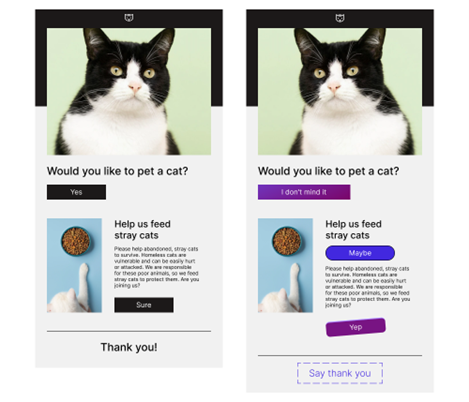
Showy emails are no more relevant today: email design trends are about simplicity and lightness. Here are several characteristics of a neat, classy email:
- It has one or two clear and concise calls to action;
- It has one button for one CTA (sometimes, when you have a long email copy, you can repeat it one more time)
- Its color scheme consists of few colors;
- Its body consists of few elements that are united by one purpose.
3. Different styles and colors for icons and logos. The designers from my agency recommend sticking to one style and color for the logos and icons you have in your email campaigns (the same goes for social media). Don’t forget to check the brand books before you use them.
Those who are passionate about email design understand the importance of details. Each element should add up to the style of your email campaigns.
4. Wrong text alignment. Text alignment is highly underrated as an element of email design. This is not just about beauty; it’s about accessibility.
When you don’t know what type of text alignment to use, stick to left-alignment: it’s not only more familiar to users, but also increases reading speed, studies say. There’s one more type of alignment you can use, and it’s centering: it’s perfect for banners, headers, and other parts of an email copy you want subscribers to focus on. If you want to dive deeper into the topic of email copy alignment, I’d recommend reading this article from a colleague of mine.
I wouldn’t say that these mistakes will ruin your email campaign, but they certainly can harm your brand’s reputation. You don’t have to invent new strategies to replace the old ones — just be respectful to your subscribers and make sure they receive valuable, relevant content.
 Photo by Aleksandr Kadykov on Unsplash
About the author
 Ivan Ilin,
CEO of Blocks and EmailSoldiers Inc.
With 10 years of experience in email & marketing automation, Ivan Ilin has learnt all the nuances of digital marketing (both from client and agency’s perspective). Ivan co-founded a team of marketing enthusiasts that now has over 100 people.
Always open to new connections on LinkedIn.