
 How to resolve AdBlock issue?
 The perils of averages for email marketers

Introduction
As email marketers we think of ourselves as a data driven decision makers. We have stats coming at us from all angles such as open and click rates, transactional data like average order values and customer data such as time since last shopped.
Yet the phrase “lies, damned lies, and statistics” comes to mind.
Much of this information can easily misinform us and lead to making the wrong decisions. And it’s a few different email presentations I’ve seen recently that caught my eye and got the critical side of my brain whirring. It’s not that the authors of these were deliberately misleading us about the success of their campaigns, but there is an argument that they’d perhaps just misinterpreted the numbers.
The key culprits here are averages. Let’s take a look at a few of the common types of scenarios.
1) Average Order Value or Revenue per Email
In the UK the average salary is £33,402. But that doesn’t mean half of workers get at least that amount. If we look at the median value (the middle number) it’s only £25,971.
Let’s just be clear between how we calculate these 2 types of average – a traditional average (known as a mean) would add up all the salaries of people and divide by the number of people. The median sorts all salaries by highest to lowest, and then picks the middle value.
The differences between the averages in this example is due to there being a very small number of people who earn huge amounts of money that drag the average up (It’s also why we seem to have politicians of both sides of the fence quoting different numbers and calling the other side liars!).
What on earth does this have to do with email you might ask?
Well, when measuring revenue we have to ensure that bias of a few high spenders doesn’t lean to making a wrong decision.
Let’s take an example of the following fictional but realistic A/B split test. The only thing that changed was the 2 designs. It was the same offer and the targeting was the same. Which one is the winner?
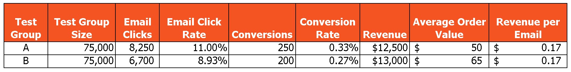
Well, you could argue email B because it generated more revenue thanks to the higher average order values – more revenue trumps everything right?
But when we run an A/B test under strict conditions the maths behind proving the statistical significance of the test is based upon on whether a conversion did or not happen, not by how much.
In this instance using the statistical significance calculation on the number of customers ordering we know that if we were to repeat this test 95% of the time we would expect the same outcome for email A winning in terms of orders.
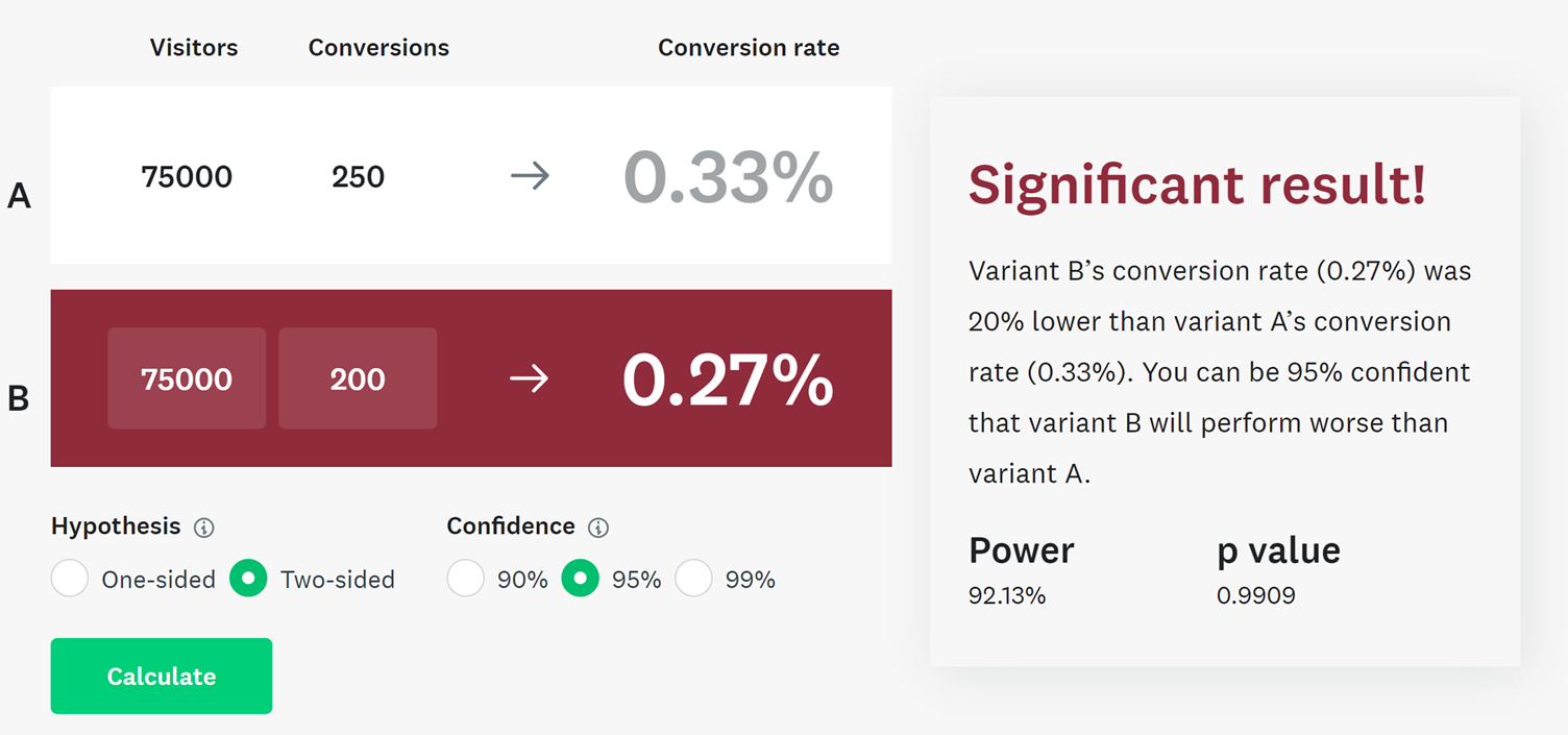
The amount a customer spends has an element of randomness we can’t control. If there was something in the test that encouraged customers to buy a more expensive item, then you could argue the case that email B encouraged more revenue and therefore is a legitimate winner.
But if you were to drill into the raw purchase data the chances are you’d find a few extremely high purchases from email B and/or low value purchases from email A dragging the averages out.
To cater for the extra layer of randomness that a variability like revenue can bring would require huge volumes of orders. The chances are if you repeated the test a few times you would get the same result of email A pulling in more orders, but you would expect the AOV winner to go between A and B with A winning that if you repeated it enough.
If you have a test like this where you have a result like this, you have 3 more options to give you confidence the one with the most conversions is the winner:
- Repeat the test – the more you repeat, the more data and confidence you have if trends continue
- Use a median average spend
- Remove the top and bottom 10% of conversions from either pot to reduce outlier transaction amounts
This is more work I know as no ESP or web analytics tool gives you this, you’ll need to extract the raw transactions, but this does show the problem with averages.
2) Time since last purchase
This is the one I come across the most. This is where brands are making decisions based upon when a customer has churned. Some use arbitrary numbers that ‘feel right’, some use metrics such as:
![]()
This gives you an average days between purchases. It’s then used to add that number of days onto their last order date, and if that is after today, they count as lapsed.
This is another area where the simplistic average falls down. If someone has only shopped twice, and that happens to be a year apart that means you won’t treat them as lapsed for another year, at which point any reactivation activity is going to struggle due to the passage of time.
It works badly the other way as well. A frequent shopper, perhaps who has shopped 20 times on an average weekly basis would look lapsed after a week. But customers don’t tend to order in fixed patterns and will order in clusters of activity with longer gaps in between. The result of any reactivation activity here is you end up giving discounts away to those who are really still active.
Now if you are lucky enough you could use a prediction tool to help you with this (assuming the prediction tool does a better job than just automating the above calculation – many don’t!).
The better option for understanding where the majority of customers lapse is rather than look at averages we use a distribution of values, but also crucially break this down across different customer segments.
Below is a chart that shows days since last purchase but crucially alongside number of past purchases:
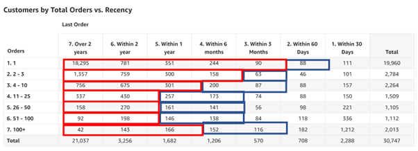
The red and blue lines are shown to highlight when customers are confidently lapsed or at risk from lapsing – and these numbers change per segment.
We can repeat this approach in other ways to look at how a distribution of values shows a different picture to an average.
Days to 2nd purchase
How quickly do customers typically place that 2nd order? Well, if you are using an average, it’s a lot quicker than you think, probably most likely within 30 days of the first order. If you don’t get the order, then the chances of ever getting it are slim. The small number of people who make their 2nd order over 1 year later, maybe 2-3 years later pull the average out.
Here is a real example showing the distribution of when customers placed their 2nd order:
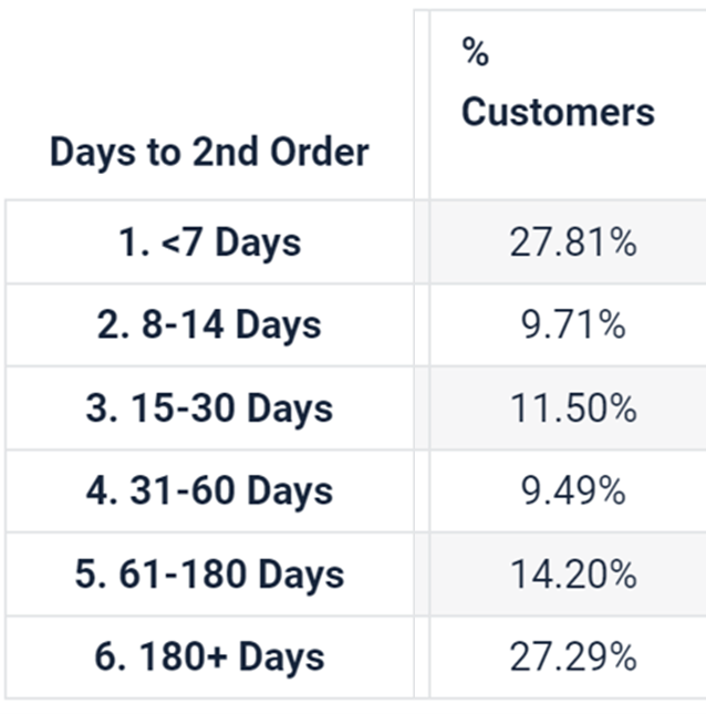
The average is actually 118 days after their first order, but this shows over ¼ do so within just 7 days, and half inside a month.
If you look at it this way, how would you change the timing of next purchase and new customer campaigns?
Number of purchases till upgrade to a delivery pass or membership
Conventional wisdom would suggest customers will need a few purchases before they are ready to commit to signing up for a free delivery pass Amazon Prime style, or perhaps get a monthly membership so you wouldn’t try and convert people at this point. Using an average would agree with that. However, all the data I’ve seen shows the most popular time for people to get these is during first purchase, perhaps because they have strong motivation at that point.
Number of emails until a subscriber unsubscribes
I’ve seen a few articles out there that state the average time someone stays on your list. This is usually followed with advice around why it’s so important to keep the volume of new email addresses added high to replenish those who have left.
But this usually just makes the mater worse. The vast majority of unsubscribes happen in the first few weeks after signing up. And the lower quality the signup, the more likely they are to unsubscribe. This report on Marketing Charts from Return Path (Yes, this is old but still relevant!) shows the subscriber retention rates at 30 days and 12 months for top brands. You can see there is marginal difference between 30 days and 12 months, but by 30 days most are gone anyway.
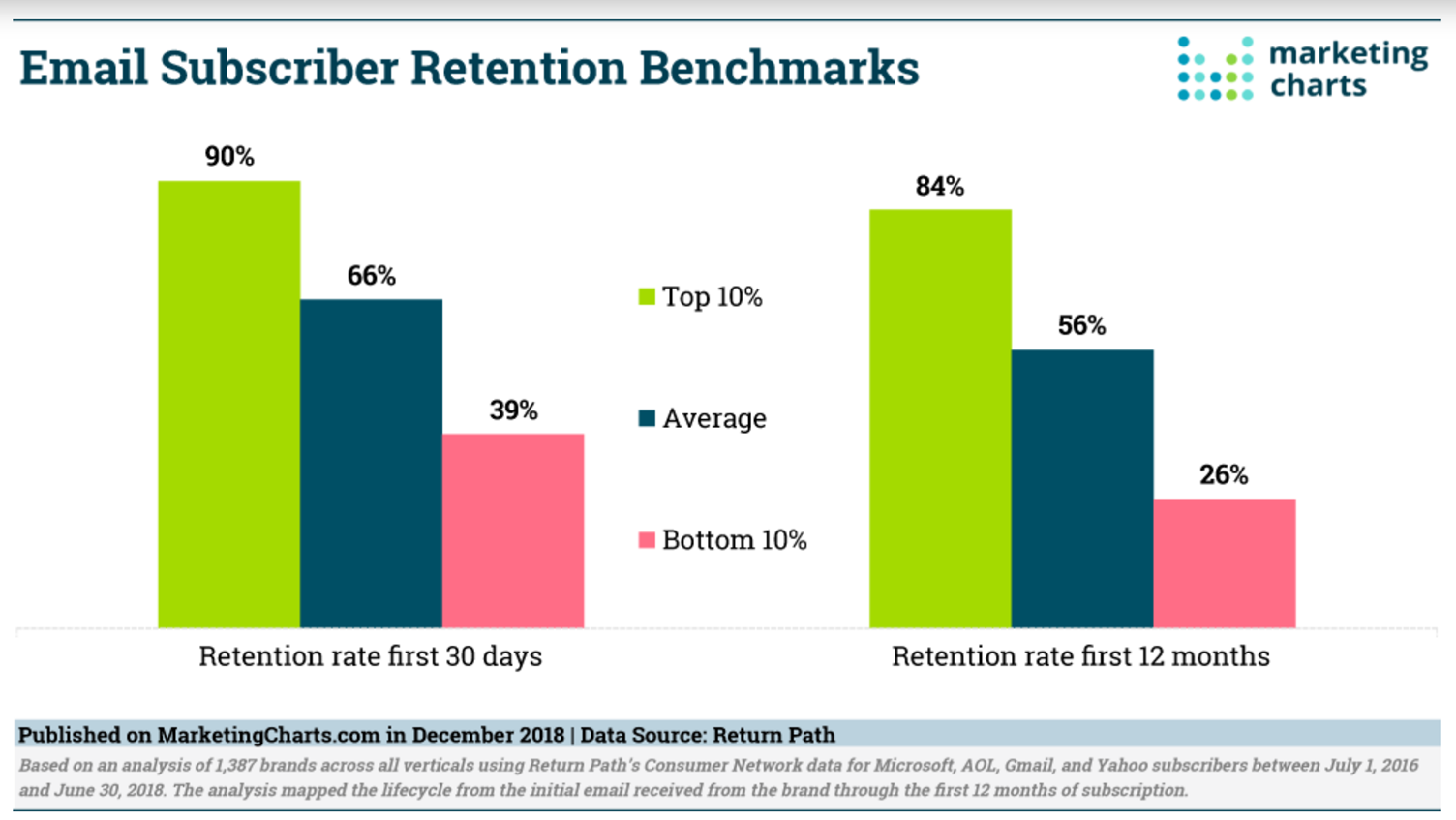
Using an average here to promote the demand for list growth just isn’t useful. It assumes that all subscribers are equal – those who are never going to shop but like entering free prize draws are the same as those that shop 100 times.
That just leads you to being busy adding more and more cheap email subscribers that will continue to unsubscribe quickly without any meaningful difference to the revenue your email programme generates.
3) Averages aren’t all bad
Now this isn’t to say all averages are bad. They are useful for comparisons – for example ‘what was my average open rate this week versus last?’ And therefore, do I think I have deliverability issues?
But to make averages most useful it is to drill down into the results to break it down by segment.
One recent example of this is a reactivation campaign for an online retailer. If we took the overall response rate for the entire segment targeted the results were not statistically significant versus our hold out cell.
But as soon as we took out the mass of customers who had only shopped once or twice previously the differences in performance were obvious, and the test easily beat control.
The hypothesis here is those one- or two-time shoppers who made up 75% of the audience are the least engaged and often only shop at Christmas for gifts. Their reduced response rates drag the performance numbers closer to that of control, so you find it harder to get statistical significance on your results.
If we hadn’t drilled down, we would have not run the campaign again and missed the opportunity for the strong revenue it delivered.
We are still using averages here, but in a more refined way.
Some other examples of how we might apply that in analysing email marketing activity include:
- Click rate by favourite product category – do we find click rate varies in these segments based upon the content in the email? If sending content based upon their favourite product category boosts clicks is that our business case for personalisation?
- Open rate by signup source – is it even worth acquiring customers from certain channels or initiatives?
- Lifetime value by first purchase type – if customers who buy from certain categories or brands on their first purchase are worth much more shouldn’t we be looking for more of them and working with our buying and merchandising teams to make sure we always have an offering for them?
4) When averages hide big numbers
The final challenge with averages is it doesn’t take into account actual physical numbers.
If you double your email frequency that will likely reduce your average open and click rates. If we take an example of a retailer with 100K list sending 3 emails a week at 2% click-thru rate that is 6,000 clicks a week.
Doubling volume to 6 emails might bring that average click rate down to 1.5%, a decrease of 25%. But actually, you get 9,000 clicks, a 50% increase.
Comparing averages alone without considering volume can lead you to focus on optimising the wrong numbers. Perhaps you have a bunch of customers that convert at half the rate of others – but there are a lot of them so that small percentage adds up to a large amount. And vice versa – you might have incredibly valuable segments within your customer base with high average LTV – but there are very few of them. Even if you double the amount of them it doesn’t add up to much.
Final words
Averages are used by us all because they are simple to understand. And because often that is all that’s easily available thanks to what ESPs and web analytics tools give us in their reporting.
But every now and again it’s important to step away from our frantic schedules and reassess if what we think we know is really the truth. And those pesky averages are a good place to start.
 Photo by charlesdeluvio on Unsplash
About the author
 Sean Duffy is founder of Segmentum, an eCRM strategy & implementation agency, and Reignite, a real-time email personalisation platform.
Sean has been in the email marketing industry since 2003, initially spending 10 years at a start-up ESP, helping establish them as one of the UK's leading email marketing platforms. Since then he has also worked client-side before creating Segmentum in 2015.