Using Persuasion to Move Customers Along on Their Journey
Persuasion: It's not just the title of a Jane Austen novel.
Persuasion is at the heart of all effective advertising and marketing. I’m not talking about dodgy tactics that trick customers into opening and clicking on emails. Instead, I mean the persuasive principles and tactics that help customers to make decisions and move through the journey from initial contact through purchase and on into loyalty.
These help customers make their own decisions more easily, faster and with more confidence that they’re making the right decision.
I’ve researched, written and spoken about using persuasion and psychology to enhance our email messages for more than 10 years because we marketers need to understand why and how people do what they do. When we know that, we can adjust our messaging strategies to connect with them on their level.
While personalization can help capture attention, effective persuasion makes our email messages resonate better with our customers.
But we also must explore why we have to do more than create an email that capitalizes on the human fear of missing out or need for approval from others. Effective persuasion isn’t a one-shot deal. It’s like a lasagna that combines persuasive copy and design together with a mixture of psychology and cognitive helpers.
Let’s serve up that lasagna and see what’s inside.
Persuasion is rooted in psychology and the unconscious
Let’s start by thinking deeper about what persuasion is not. We aren’t trying to talk someone into buying something they’re not interested in or in telling them how great our brand and products or services are.
Instead, persuasion and psychology are part of the wider discipline of behavioral science, which studies how humans make decisions. Because our goal as marketers is to help our consumers make decisions, knowing why they do it is essential for creating effective marketing.
Working Psychology defines persuasion like this:
"Persuasion attempts to win 'the heart and mind' of the target. Thus persuasion must induce attitude change, which entails affective (emotion-based) change. Although persuasion is more difficult to induce, its effects last longer because the target actually accepts and internalizes the advocacy."
We’re appealing to shoppers’ unconscious for a good reason: "Research shows that more than 90% of our decisions are unconscious."
This is the main tenet of Douglas Van Praet's 2014 book, Unconscious Branding: How Neuroscience Can Empower (and Inspire) Marketing, in which he cites research done at the University of Virginia.
Van Praet, also a marketing consultant and advertising veteran, doesn’t say customers sleepwalk their way through your website. Rather, customers often make decisions based on memories, emotion, instinct, habit and other non-deliberate sources.
Understanding how this works in message content, design and functionality can make your emails more persuasive. Focusing on emotion is a good place to start because good communications have an emotional as well as a rational appeal.
Van Praet writes, "Influence is born by appealing to the emotions while overcoming rational restraints."
Think of it as Spock versus Kirk.
Many of us like to believe we're Star Trek's Mr. Spock. We reach conclusions consciously and rationally by researching and analyzing all the information available and then choosing the best option.
But more often, we're like Captain Kirk: acting on our emotions and then rationalizing our actions to support our emotionally based decisions. This is known as the post-purchase rationalization bias.
By emotionally engaging with your audience, whether through storytelling, using
compelling text-copy or persuasive imagery, you improve your chances of converting buyers emotionally, so that they will rationalize their conscious decisions to meet their subconscious decisions.
Persuasion principles and cognitive biases
These are the two main drivers of persuasion that we can use to help our customers to make decisions. They’re often used interchangeably, but they are quite different. Each one plays a different role in building persuasive email messages.
Persuasion speaks to the content of your messages – the copy and images. Your decision incorporates cognitive biases, or signals, which we humans look for to help us make quick, satisfying decisions.
Persuasion principles: I’m using the seven persuasion principles developed by psychologist Robert Cialdini in his book, Influence: The Psychology of Persuasion that look at deeply rooted human needs. The ones we call on most often in marketing are these:
- Social proof: We seek safety in numbers – also called “the wisdom of the crowd.”
- Reciprocity: When someone offers a freebie, it can encourage the recipient to return the favor.
- Authority: Be seen as smart (also a cognitive bias)
- Commitment and consistency: Asking for a small commitment now leads to bigger commitments later
- Scarcity and loss aversion: Appeal to the human fear of missing out on a good deal avoid. Loss aversion is also a cognitive bias.
Not every person feels each need in the same way, or even at all. But they are more or less universal, in varying degrees, so that you can expect to reach a sizable portion of your audience if you use one, or more, as a basis for your message copy and design.
Cognitive biases : Coming under Behavioral Science, these are the unconscious cues we’ve created to take the friction out of decision-making. They aren’t so much psychological characteristics as shortcuts we use to make fact-finding and decision-making easier.
While they have a psychological basis, they’re used most often in email marketing when designing a message to highlight what’s important, bring clarity, and encourage readers to do you want – mainly, clicking to your website to check out your offers.
Although we have hundreds of cognitive biases to choose from, these four are particularly useful in email messaging:
- Cognitive Ease bias/Law of least effort : Offer customers the easiest path to conversion, such as using a call-to-action button instead of a text link.
- Anchoring effect : Present both original and sale prices, or offer three levels of pricing to make the most desirable price stand out
- Less-is-better bias: Present fewer alternatives such as product images or calls to action to avoid choice paralysis
- Isolation (Von Restorff Effect): Use design tactics such as color and white space to highlight the key characteristics or actions.
5 combinations of persuasion principles and cognitive biases
Although persuasion principles and cognitive biases serve different purposes in your email construction, you can increase your impact when you use them together strategically.
You could, for example, build a message around loss aversion, as most of us hate to miss out on a great deal. But if you don’t structure your message in a way that makes your points clear or direct them to action, you could be the one losing out.
The examples below show you how to create a more persuasive message by combining persuasive copy with a design that eases the cognitive load and nudges them into action.
As always, with everything you do in email, testing can show you which combinations can be more persuasive with your customers. What works for a fast-moving consumer goods brand might not resonate with a luxury clothing brand or a travel company. See my conclusion for more on using testing to discover what can work in different message scenarios.
1. Persuasion principle: Authority
Cognitive bias: Implicit visual design cue, cognitive ease
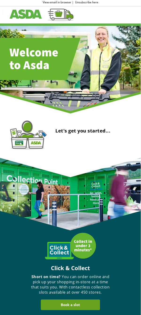
Brand name: Asda
Subject line: Welcome to Asda

As a persuasion principle, authority usually implies that people will engage with you if you’re seen as an expert. One way to express this is to send regular emails in which you share your expertise to help customers learn more and buy successfully.
A welcome email is an excellent place to begin cultivating authority because it will enhance all of the communications you send after that. In this welcome email, Asda shares how customers can shop the supermarket brand more effectively and why they should trust Asda product quality. (It’s a super-long email; I’ve condensed it to just one section for brevity. View the full email.)
The email uses implicit design cues to enhance cognitive ease by designing each section as a downward-pointing arrow, which guides the eye down through the email as a way to get all the sections seen.
2. Persuasion principle: Loss aversion
Cognitive biases: Anchoring, implicit visual design cue, loss aversion, Von Restorff Effect
Brand: Depositphotos
Subject line: This 70% offer ends in hours

This email looks short and sweet, but a lot of persuasion is happening under the surface, and that’s just how it should be!
Loss aversion is probably the most popular, and an incredibly effective persuasion principle because it’s so easy to send a last-minute email campaign that can push people to act on a deadline. It can also be easy to overdo and lose the effect of it, so only choose it when it’s most appropriate.
The subject line sets the persuasion principle in motion because the 70% discount is sizable enough to grab attention for this brand’s niche audience of designers. Noting that it is about to expire can kickstart the “move fast or lose out” instinct.
Loss aversion is also a cognitive bias. It works together with the others in the message design. It uses a countdown timer and big red reverse bar saying “Last day to save big” to drive that point home.
Anchoring is the human tendency to rely heavily on the first piece of information offered (the “anchor”) when making decisions. Here, the anchor text is $299.
The next piece of information is the discounted price of $80. The subject line has already primed the reader to expect a deal, and the combination of strikeout copy and slightly boldfaced new price delivers.
Next up: visual design cues. These can be explicit or implicit, as they are here. One popular design cue is a face whose eyes are looking at the price or the call to action. This directs our own eyes to look the same way.
In this email, the cue is quite subtle. The pastel color blocks on either side of the white box with the offer copy are stylized human profiles, and they are shown looking at the offer and the CTA button. Would you have noticed that if I hadn’t pointed it out? Consciously, maybe not. But your subconscious is saying, “Look! Look! Look!”
Finally, isolation – the Von Restorff effect. It’s used to highlight key information by presenting it differently from the content around it. In this message, the bright red reverse bar across the top and the matching CTA button stand out against the blue background and pastel color blocks surrounding the white copy box.
Small design – big impact.
3. Persuasion principle:
Cognitive bias: Law of least effort
Brand: The Sill
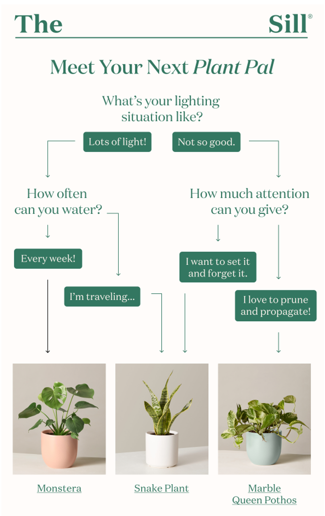
Subject line: What’s your light situation like?

This email shows how you can persuade through both authority and reciprocity, which is the principle that by doing a favor for someone, the recipient will want to repay the favor by doing something for the giver.
In this email, Sill combines its authority – its plant knowledge – with reciprocity to help shoppers figure out how to buy a plant based on three key elements: light, water and attention. Instead of just saying “Buy this cool plant,” it helps shoppers find the right plants that meet their own capabilities. The result: fewer dead plants, more happier customers.
Sill uses a simple decision tree that asks basic questions, so customers feel more confident about their decisions, which requires less cognitive effort than reading paragraphs of copy. Plus, framing the product as a “plant pal” (anthropomorphism, another cognitive bias) invests the decision with a little emotional impact. This is a pal, not just a plant!
4. Persuasion principle: Social Proof
Cognitive biases: Von Restorff Effect, Explicit visual cue
Brand: Who Gives a Crap
Subject line: Long time no see

The persuasion principle of social proof holds that we look to others for confirmation about making decisions. It’s also called tapping into the wisdom of crowds. Email is an excellent vehicle for social proof because you can pull customer comments in from reviews, social posts, customer service and other resources.
This email from Who Gives a Crap layers several tactics together to increase its persuasive power and counter uncertainties and potential negative impressions that could stop email readers from buying. One tactic is social proof by importing a customer comment that goes to one of the primary concerns about buying toilet paper from alternative sources.
The other is an explicit visual clue that directs the reader beyond the first call to action to the first point. The green arrow doesn’t overwhelm the message but is noticeable enough thanks to its contrasting color against the blue background and the tan copy box color. Want to see how Who Gives keeps readers scrolling through a long message? View the full email.
5. Persuasion principle: Commitment and Consistency
Cognitive biases: Cognitive ease, Von Restorff Effect
Brand: MoneyGram
Subject line: Start earning your member rewards today

The persuasion principle of commitment and consistency can be interpreted in many ways in marketing. Generally, the brand asks customers to make small commitments first and then comes back later to ask for larger ones. It’s also called the “foot in the door” tactic. People in general like to be consistent, so decisions they make take today will guide future decisions.
Nonprofit organizations often use this concept by asking people to sign petitions, a low-commitment action that can reduce objections when they come back later to ask for a donation or volunteer time.
This also can build loyalty programs for brands. Asking people to join a free VIP or repeat-purchase program is a low-barrier request. But it also can compel customers both to read future emails instead of discarding them and to buy in the future.
For MoneyGram’s customers, the first step is signing up for the loyalty program. The next step – the larger commitment - departs from most ecommerce loyalty programs when it delivers the incentive (a 20% discount on the second money transfer instead of on the first one, as most loyalty programs do). But it also reinforces that request by reminding program members about the program benefits.
That’s where the email uses the Von Restorff effect and cognitive ease to make the benefits stand out and make them easier to grasp. It uses icons, white space, and short copy in an inverse pyramid effect that draws the eyes down effortlessly to the call-to-action button.
My challenge to you
You can expand your tool kit of optimization techniques by leveraging consumer psychology insights to benefit both your brand and your customers. Don’t just limit your choices to the easy ones like scarcity/FOMO and social proof. They likely aren’t the most effective in every situation. Testing one combination of persuasion and cognitive biases against a different set can reveal which drives more results.
As you see in some of these examples, you can also apply all of these persuasion and cognitive techniques to lifecycle messages such as onboarding, cart abandonment, re-engagement and reactivation. Your result will be an email program that connects solidly with your audience, leading to long-term growth and productivity.
 Photo by Austin Chan on Unsplash

 How to resolve AdBlock issue?